-
Interior Designers: Studio O+A
- Area: 55646 ft²
- Year: 2017
-
Photographs:Garrett Rowland
-
Manufacturers: Interface, Amerlux, Architectural Lighting Works, Creative Systems Lighting, Febrik, Fireclay, Goldray Glass, Mash Studios, PAW Architectural Woodwork, Solar Graphics, Volt, West Coast Industries

Text description provided by the architects. It’s not often a design firm gets to go back and check in on past projects. Usually, we visit a few weeks after move-in, but it’s rare that we get to see a space a few years later. Meraki’s expansion to a new floor offered an opportunity to observe how the company had grown into (or in this case out of) the space O+A designed for it four years ago. Rapid growth is a good thing, but it comes with its own challenges: too many workstations, not enough storage. For Meraki’s new space, we put strategies in place that will make the future more manageable.

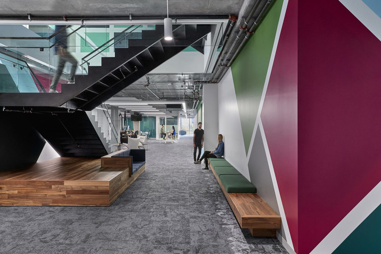
O+A’s project for Meraki 2nd Floor provided a “Day 1” plan for instant implementation as well as a “Maximum Capacity” plan for long-term growth. We located graphics and conference rooms in a way that would prevent workstations from getting crammed into every corner and keep circulation paths clear. In each of five workstation neighborhoods, we placed custom full height storage doors to prevent clutter and provide dramatic color interventions.


If we devised the floorplan to allow for organic growth, we made materials and finish selections in coordination with what had been done before. While none of the designers who worked on Meraki 4th Floor in 2013 worked on Meraki 2nd Floor in 2017, the new team recognized the need for cohesion between the two floors and approached the new design not exactly as an homage but perhaps as a variation on a theme. That theme being Meraki’s mission of connectivity and illumination as embodied by its sparkling Bayside location.

Using some of the same materials and colors from Floor 4, but using them in different patterns and combinations, Floor 2 took on a distinct personality of its own while bearing a younger sibling’s resemblance to its older predecessor. With bold, geometric graphics spanning the entire core of the building and those colorful storage walls giving each department its own chromatic signature the palette of the space is again a celebration.


